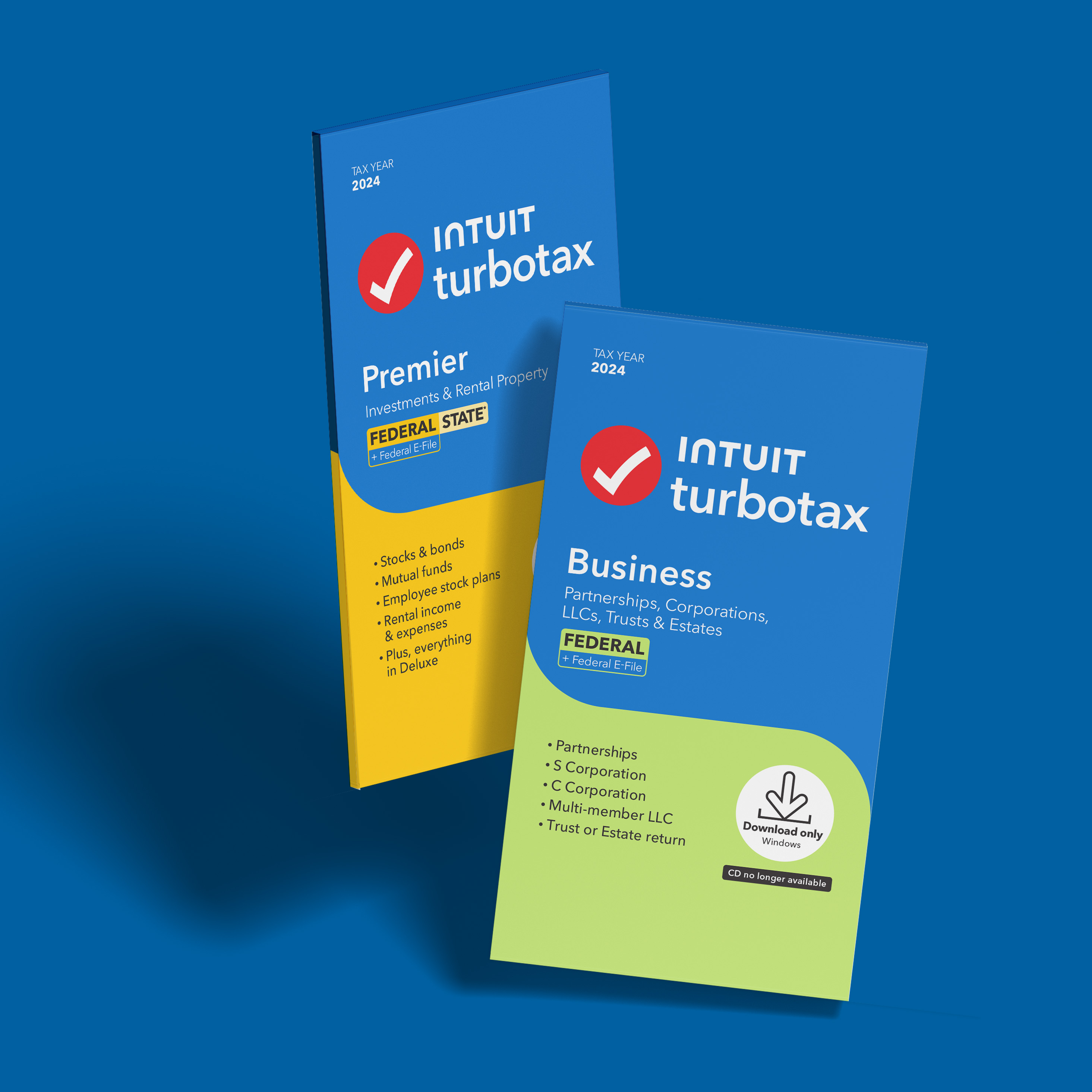
With the big change of replacing CDs with download codes for Tax Year 2024, our challenge was to clearly communicate this change on the packaging while building trust with customers accustomed to CDs.
Package design | Consumer research
Designer
The primary TurboTax Desktop audience—longtime users aged 40 to 75—are familiar with the physical CD. Since tax filing can be stressful, any change to how they access the product needed a thoughtful, reassuring approach. We aimed to show that while the format may look different, the trusted, seamless experience remains unchanged.


We conducted 3 rounds of qualitative research in Chicago, Phoenix and Denver, with round 1 focusing on the front-of-box design. We tested differences in shape language, packaging size, language and layout across 6 different concepts.
After several rounds of research and testing, we landed on a Front-of-Box design that balanced familiarity with clarity. To ease the transition for loyal users, we retained recognizable visual cues—like the friendly curves from previous packaging—while clearly emphasizing the shift to Download Only. The "CD no longer available" messaging was made prominent to reassure customers, and we thoughtfully slimmed down package size to subtly signal that a CD is no longer included, guiding expectations from the start.